Interactive whisky price charts
For our Patrons, we have added the ability to build charts based on the search results on Whisky Hunter. The charts allow you to see price trends for the whisky you're interested in in a more visual form.
Better to see once than hear 100 times!
How do I view the chart?
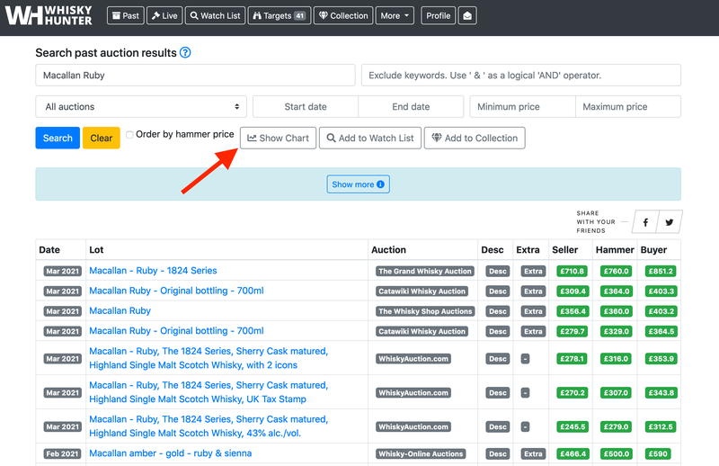
Simply search for the lots you are looking for in the past auctions results database. As soon as the lots you need are displayed, a Show Chart button will appear, and by clicking it you will see the chart you are interested in.
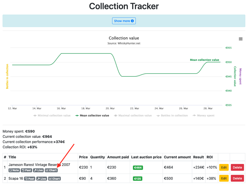
You can also see a chart for your bottles that you keep in Whisky Collection Tracker
And you can see the chart for your bottles that you have on the Watch List.

Important things to know
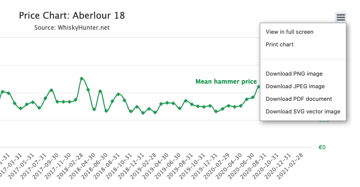
- The graph shows the average monthly (minimum and maximum) hammer price of the lots you are interested in.
- The chart is plotted based on your search query. The more precise your query, the more precise the chart.
- If there are some abnormally high or low values on the chart, you probably need to be more thorough in your search query. See the instruction on how to use Whisky Hunter search engine.
- You can zoom in on part of the graph. To do this, press any point on the chart and drag to the right or left while holding down the button.
- You can build a graph if the number of lots in your search is less than 30,000
- You can export the chart in the format you want, publish it somewhere or just show it to your friends.
Charts HowTo Whisky Hunter
Updated: March 31, 2021
Whisky Auctions Schedule & Fees
Recent posts:
The Ebb and Flow of Whisky Auctions: A Look at Reserve Pricing Through the Years
Bottle Recognition Feature
Analyzing Whisky Cask Sales at Auctions
When and where to sell or buy Macallan Fine Cacao or another new release profitably
Want To Know The Change In Value Of Your Whisky Collection Over Time?
Bottle Recognition Feature
Analyzing Whisky Cask Sales at Auctions
When and where to sell or buy Macallan Fine Cacao or another new release profitably
Want To Know The Change In Value Of Your Whisky Collection Over Time?